Cardiff Devils
Raise hell…

Introduction
Founded in 1986, and now with over 20 major honours to their name, the Cardiff Devils have always led by example, consistently challenging for major silverware in the UK’s Elite Ice Hockey League, whilst seeing weekly sellouts at their 3,000-seater rink. Limegreentangerine were invited to lead the first major rebrand in 27 years.
Client
Cardiff Devils
Industry
Sport
Services
Strategy, brand, e-commerce, video
Visit
The brief
Limegreentangerine has been a brand, web, and e-commerce Partner since 2011 and with a passionate, vocal, and hardcore following, is proud to have helped launch the Club’s first major rebrand in over 25 years.
They sought to develop an identity system that’s expressive of their dominant past but equipped to face the future. The driving ambition to increase audiences and build a distinct brand to match a truly unique and thrilling entertainment experience, both on and off the ice.



Drawing from heritage
Coming off the back of a season where they averaged over 99% arena capacity in the regular season, Wales’s only top-flight ice hockey team boasts upwards of 8 million monthly online impressions, 120k spectators cast weekly over TV and web coverage, and an engaged community program.
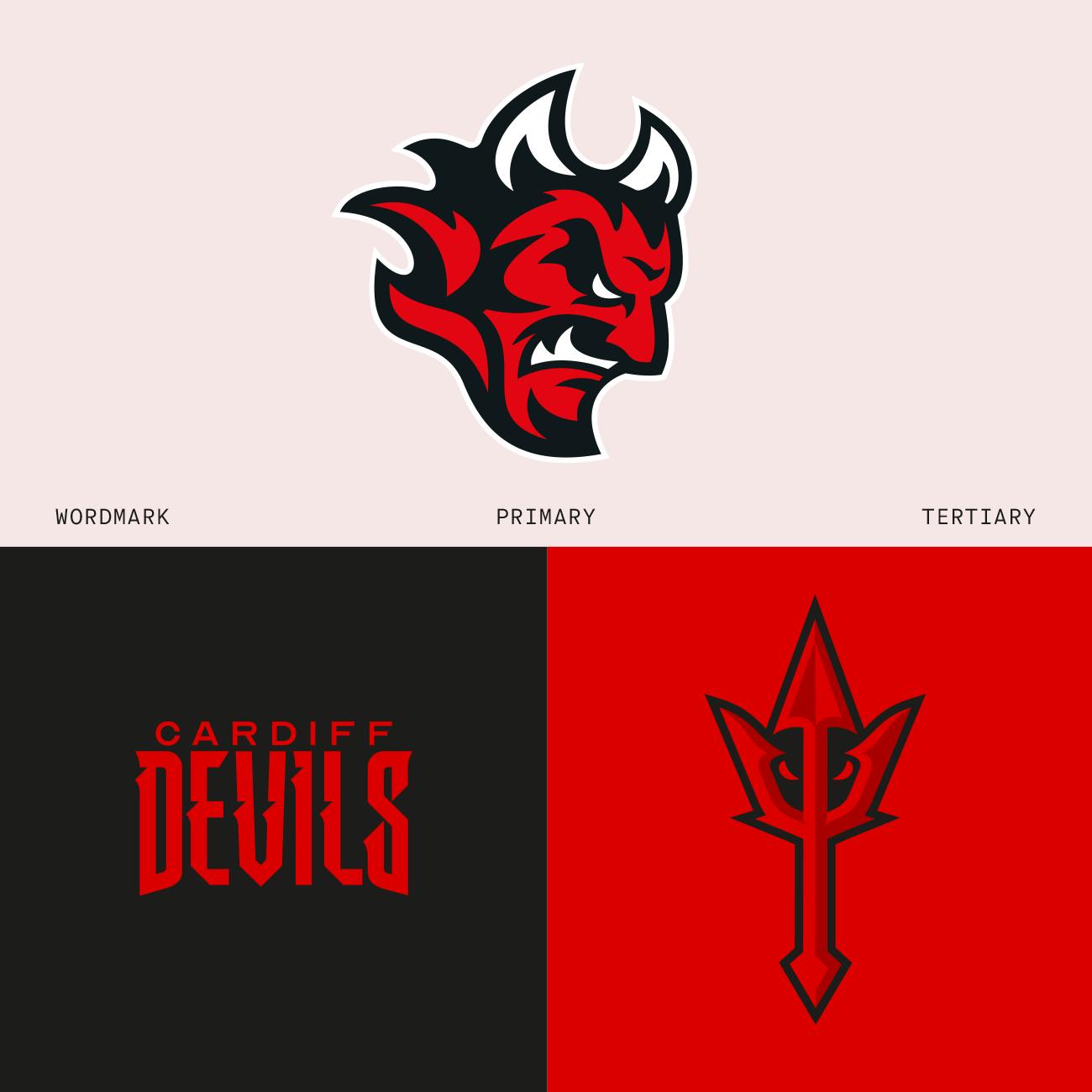
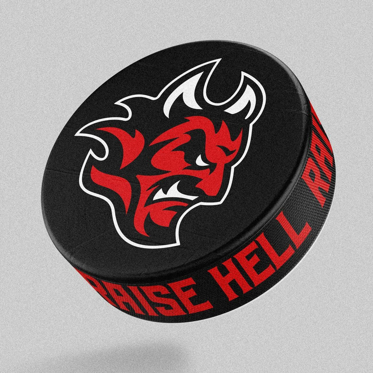
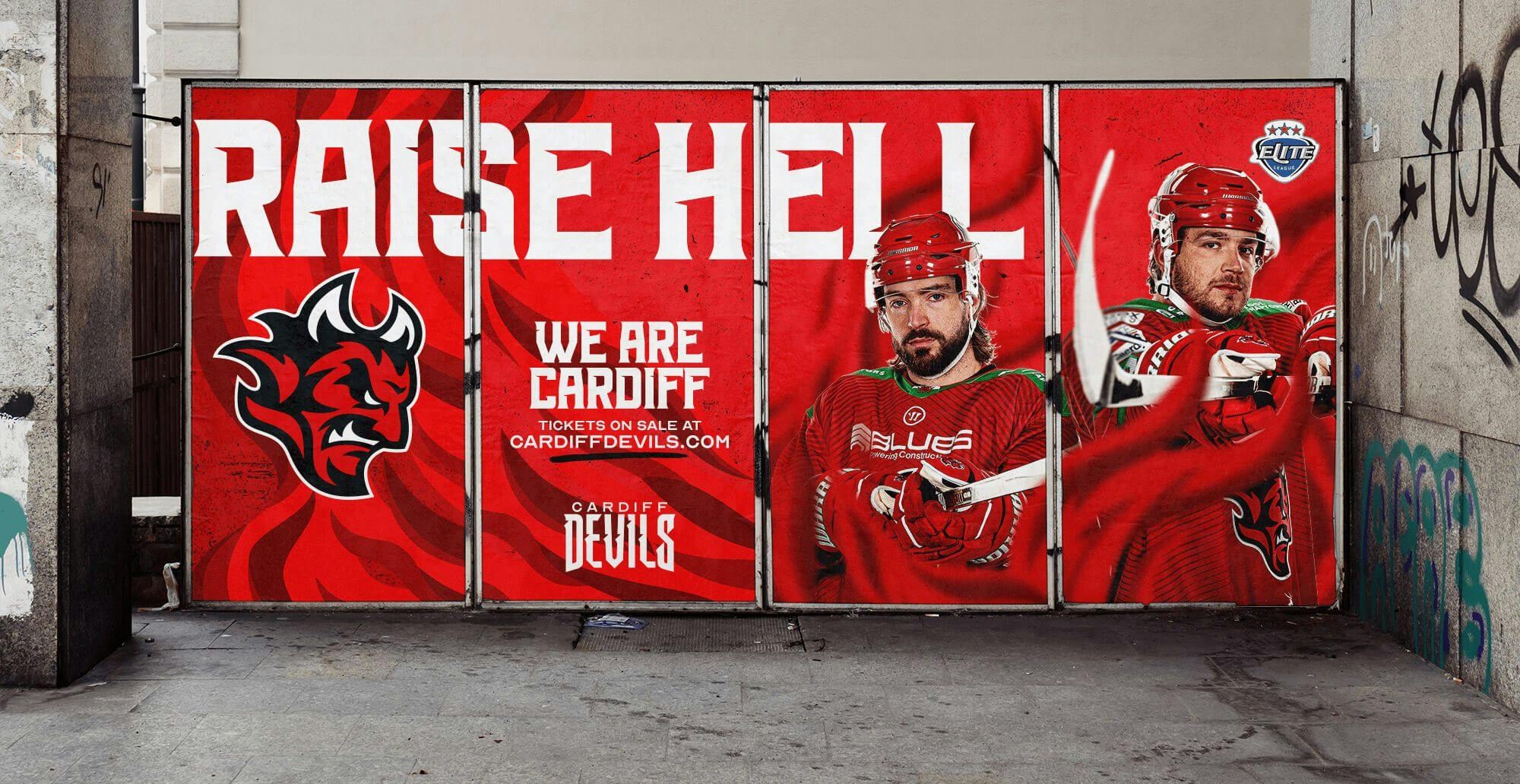
The new brand places an evolved Devils identity at the heart of everything. Finding its strength in its simplicity; fiery resilience with grit balanced out to a distinct silhouette. It’s the old logo, in a new, forward-facing guise. The pointed chin, the snarl, the cheekbone, the arched eyebrow, and furrowed brow all remain, but with added aggression. The old collar now makes way for flames. Old spirit, new attitude, designed for impact at speed.
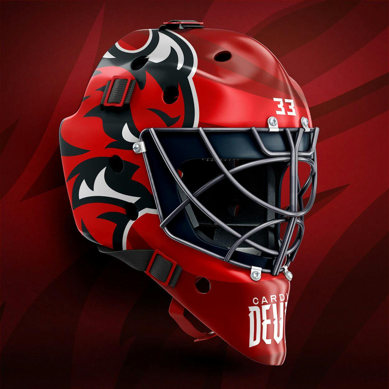
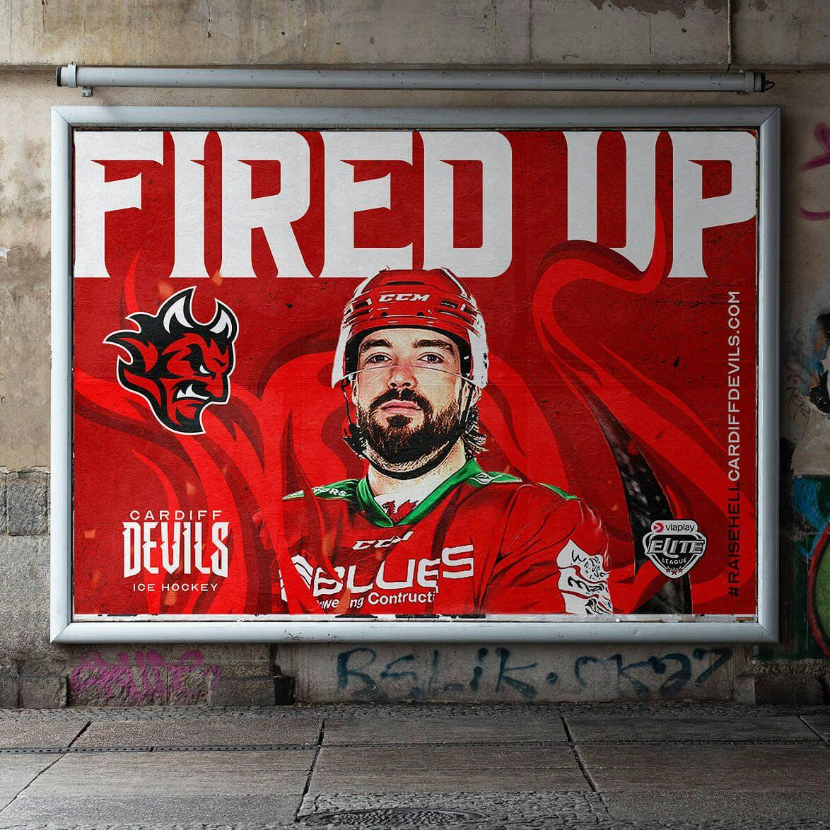
A comprehensive toolkit and guidelines pack provides the in-house team with an arsenal of branded assets.









Pride in passion
We understand the passion of the Devils supporters — we’ve been supporters, sponsors, and Digital Partners ourselves for well over a decade — so we’re more than tapped in to the fierce love people have for this Club.
Like many, we’ve loved the logo but we also understand more than most the commercial need to develop. Along with Todd, Katrina, and the owners, being custodians of the Club’s brand makes the enormous weight of responsibility palpable.
The brief, however, was always clear; how can we make this simpler, more impactful but still keep the brand’s soul? Brands must always evolve and sometimes that evolution needs to be a big one. So, after countless hours spent spanning 12 months, it’s with immense pride we’re finally able to share a fresh identity that will help carry the Club writing a new successful chapter on and off the ice.
A new digital age
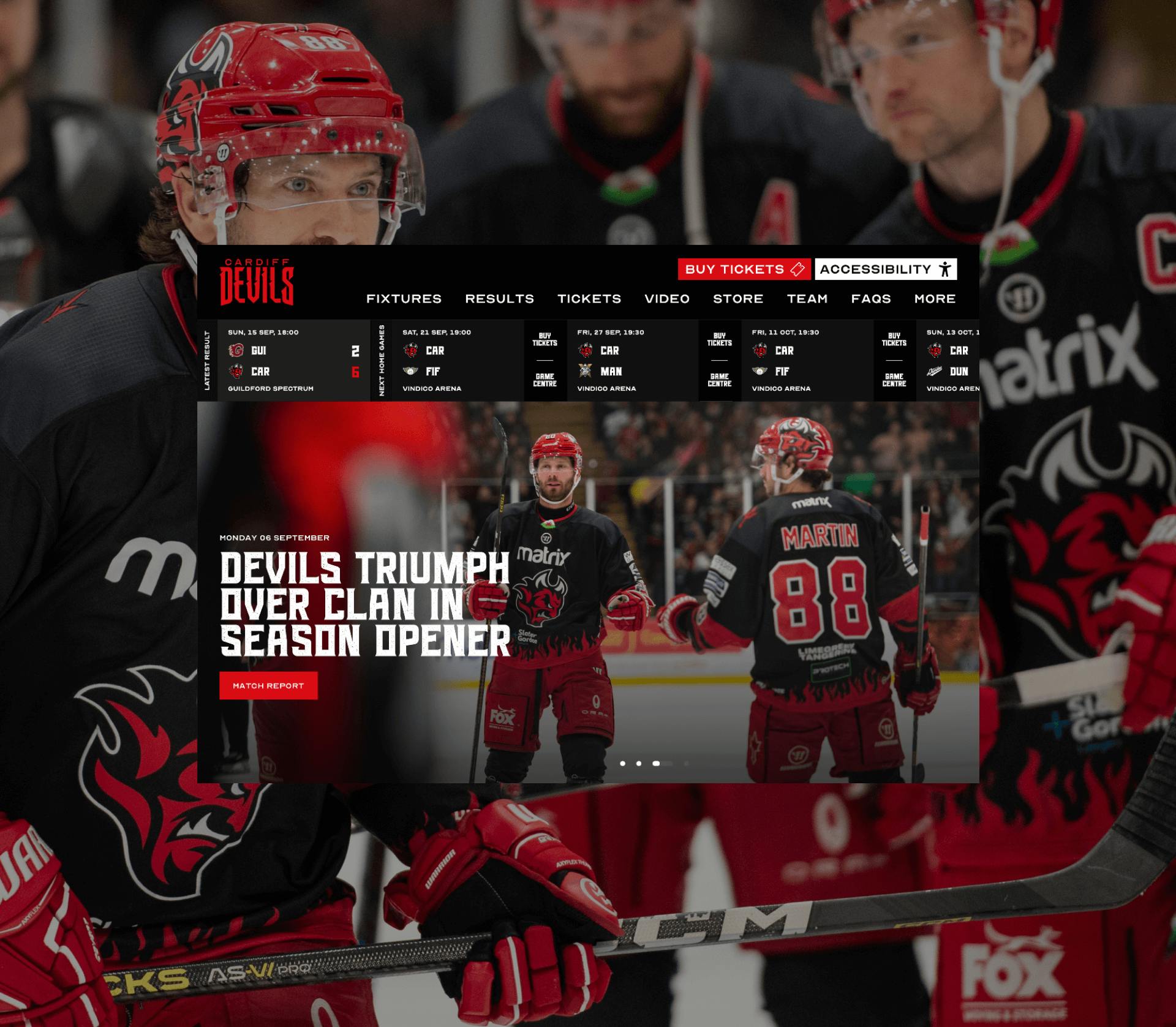
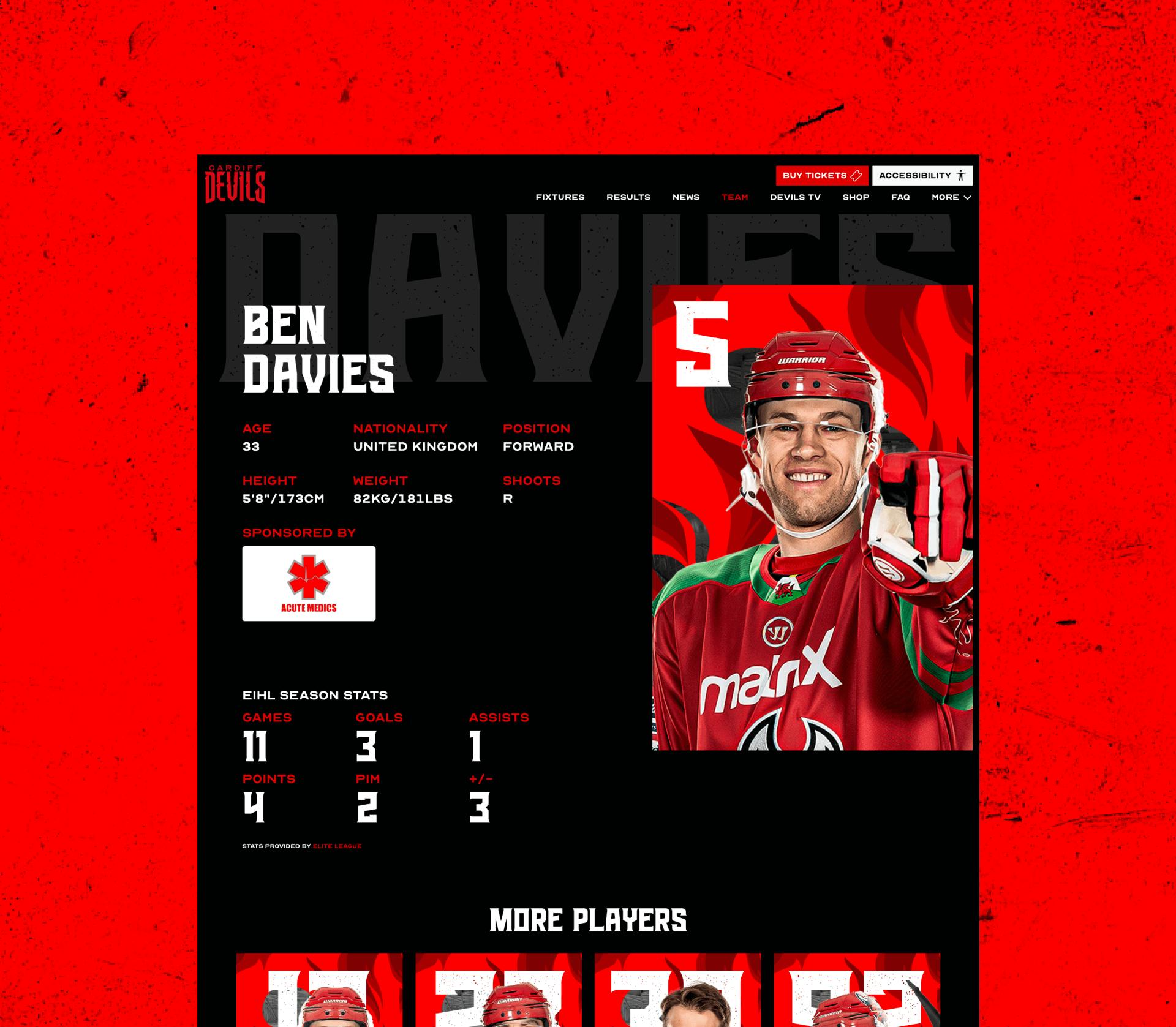
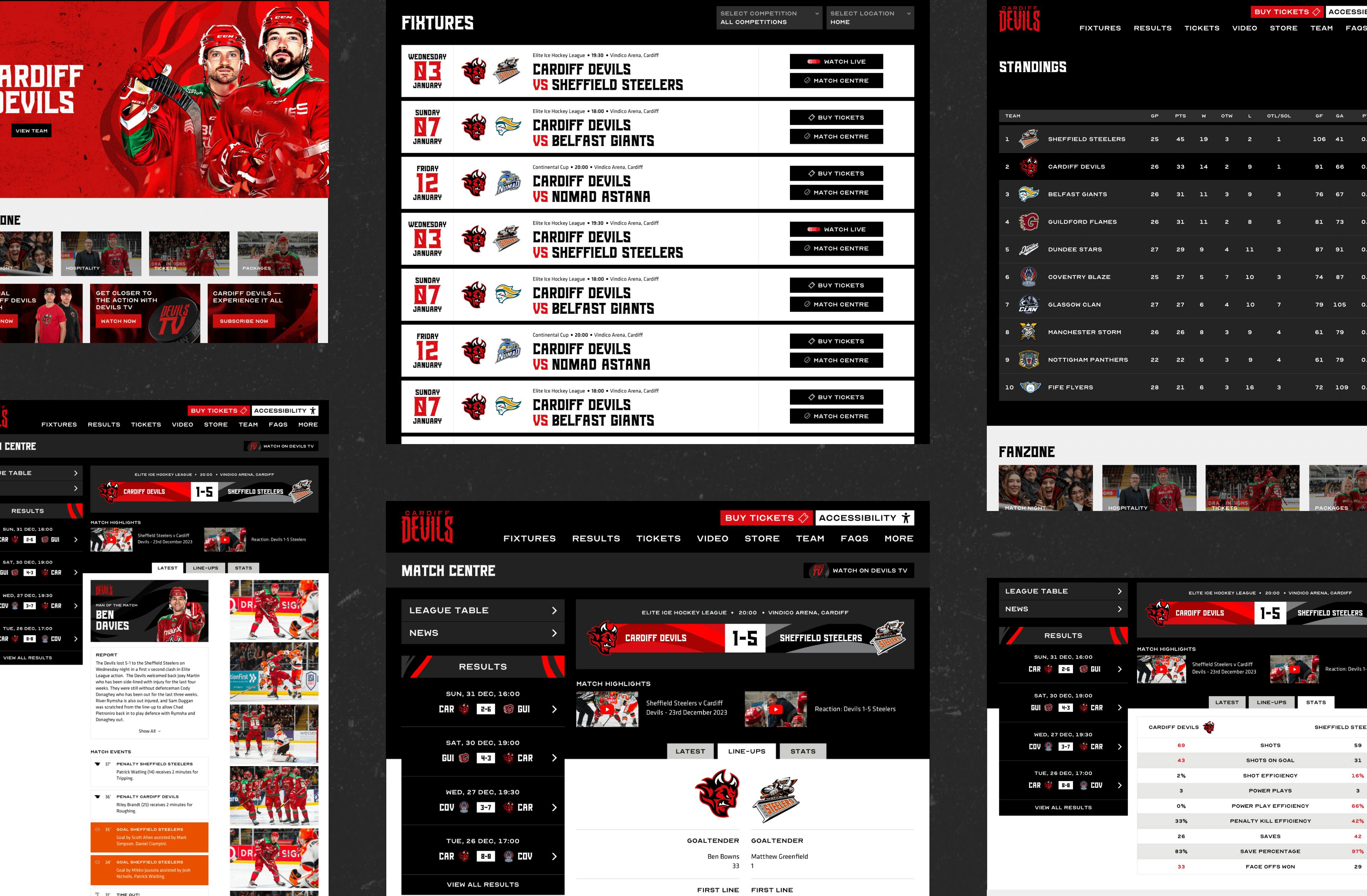
The launch of the new brand called for a revamped website. The new site focuses on delivering a improved user journey presenting fixtures, results, and ticket sales seamlessly. A custom fixtures and results bar, just below the main navigation, ensures easy access to key information, while spotlighting tickets and the all-new match centre. The website fully embraces the new brand identity, integrating its unique style throughout every aspect of the Cardiff Devils organisation.
Relationship
As the partnership between Limegreentangerine and the Cardiff Devils evolves, so does the vision for the future. A comprehensive digital strategy aims to bolster the Club’s online presence, elevate brand visibility, and foster meaningful connections with fans and supporters alike.
With this digital legacy in the making, Limegreentangerine and the Cardiff Devils embark on an exciting journey, poised to redefine success in the digital landscape and carve a legacy that’s ready to lead the sport into a new era.
The work won a Bronze trophy at the 2023 World Brand Design Society Awards.
We wanted a logo that was simple, modern, and could meet the requirements of the digital world. We are thrilled with the final results delivered by Limegreentangerine. You have to measure by how popular it is, and we’re selling double the amount of merchandise we’d usually do…


