St David’s Academy
Strive, serve, love, learn

Introduction
St David’s Academy School (SDAS) was a project to build a unique and ambitious international establishment where children aged 3–18 will be educated, not only to access the world’s leading universities but also to develop into extraordinary global citizens.
Located within a lakeside development extending over 700 acres at Llanilid, just five minutes north of the M4 between Cardiff and Swansea, the school and its extensive facilities will occupy 30 of these acres.
Client
St David’s Academy
Industry
Education
Services
Brand, illustration

Making the icon
The building was to be designed by Jonathan Adams – one of Wales’ foremost architects. Adams is perhaps best known for designing the Wales Millennium Centre in Cardiff Bay, as well as many other landmark educational and civic buildings including the Combined Universities in Cornwall and the HQ of the Welsh Joint Education Committee (WJEC) in Cardiff.
Creating heritage
Learning evolves through exploration, growth, collaboration, openness and reflection through academic, personal development and human ecology programmes. As a new school in a new facility, SDAS was to be in the unique position of building, brick by brick, one of the most modern, bespoke and exciting facilities in the world. This feeds into a philosophy of modular learning platforms whereby spiritual, conscious, critical and creative thinking converges with practical and applied discovery to piece together well-rounded, worldly students.
Crucial to the project was reflecting this grounding, whilst building a picture of an independent school – that does not yet exist as a physical space – filled with teachers and children. Comprehensive building blocks laid to started a semantic exploration through to written language and presentation.
Logo development explored three significant routes; one of spiritual and holistic symbology; another of growth, nature and a flourishing expression; and the final of variants on the reimagining of traditional crest conventions, to build institutional gravitas and establishment. This route also leveraged the Welsh dragon, underpinning a distinct sense of place and pride to the Welsh Academy.

New approach
Whilst the school embraces new ways of thinking, teaching, learning and functioning, there is an inescapable expectancy of presentation bonded with private schools with ambitions of top-end, world-class pathways. With that in mind, we crafted a modern interpretation of the established, heraldic emblem to balance the modern and the traditional.
The dragon is an inescapably synonymous emblem of Wales. Accepting there is, perhaps, an internal weariness there is a good reason it fronts both the devolved Government and tourism bureau; internationally there is a recognition and positive acknowledgement for its associated symbology. As a new institution finding its place in the world, the visual strategy helps manufacture standing and a sort of indited heritage.


A Dragon for SDAS
The SDAS dragon is not a typical fudge-box rendering but a contemporary, dynamic representation fit for the digital age—emblematic and proud. He faces the world with conviction and alacrity, bearing a pennant as he leads. Within the crest, he roosts upon open, flowing book pages, mirroring the rolling natural setting.
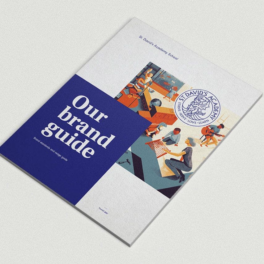
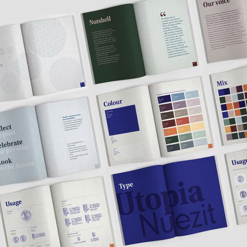
The brand is led by an upstanding primary blue supported by earthily toned colours creating the complimentary palette. Illustrator Léonard Dupond was commissioned to create the first of an absorbing collection of illustrations. These are supported by an icon system and a set of four patterns (to echo the school motto—Strive, Serve, Love, Learn) which thread a subtle Celtic texture. A comprehensive brand standards guide and toolkit has been compiled to guide the internal team on handover.


Our challenge in creating a new brand for a new company with an unconventional approach to a traditional product was to find an agency that could understand our vision and translate that from a blank sheet of paper into compelling results. In Limegreentangerine, we got exactly what we needed, from brand concept and design through to a website that has been universally praised. Throughout the process, LGT provided insight, perspective and undoubted technical expertise, combined with patience, humour and professionalism.