Trefloyne Manor
A quiet escape…
Introduction
Trefloyne Manor is a family-run, luxury venue which includes 12 individually styled 5-star rooms, a self-catering apartment, an award-winning AA Rosette restaurant, together with a luxury wellness retreat, and an 18-hole parkland golf course nestled in the Ritec Valley, just a mile from Tenby.
Client
Trefloyne Manor
Industry
Leisure, hospitality, destination
Services
Strategy, brand, web
Visit
The brief
Trefloyne is framed within sweepingly scenic surroundings, and its seasonal menu is flavoured by Pembrokeshire. It’s an unpretentious, relaxed, elegant taste of Tenby in a contemporary and rustically chic setting, touched by nature and history alike.
Family-run and welcome-focused, it’s a destination for food lovers, golfers and getaway chasers, offering experiences underscored by genuine quality. They approached Limegreentangerine to create a new brand identity, story, and experience for this West Wales destination.
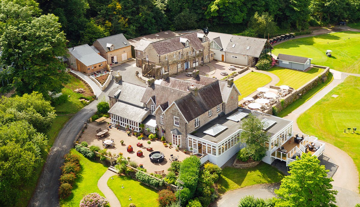
The earliest associations of this location date from the early Celtic monks with remains dating back to the 11th Century, there’s an abundance of original features and rustic, period charm. The Dovecote spa and wellness retreat is housed in the last remaining element of the ancient Manor, and is truly magical.
Mark of distinction
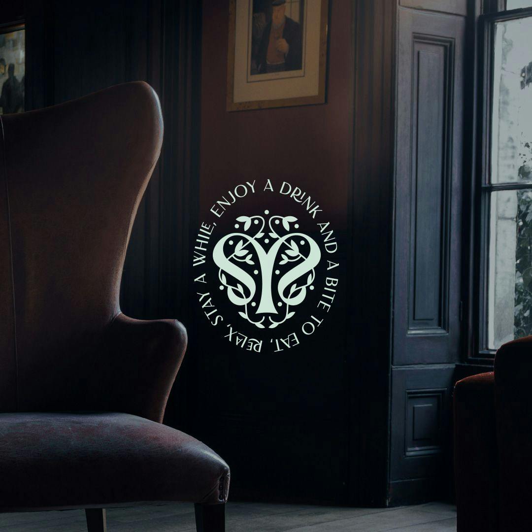
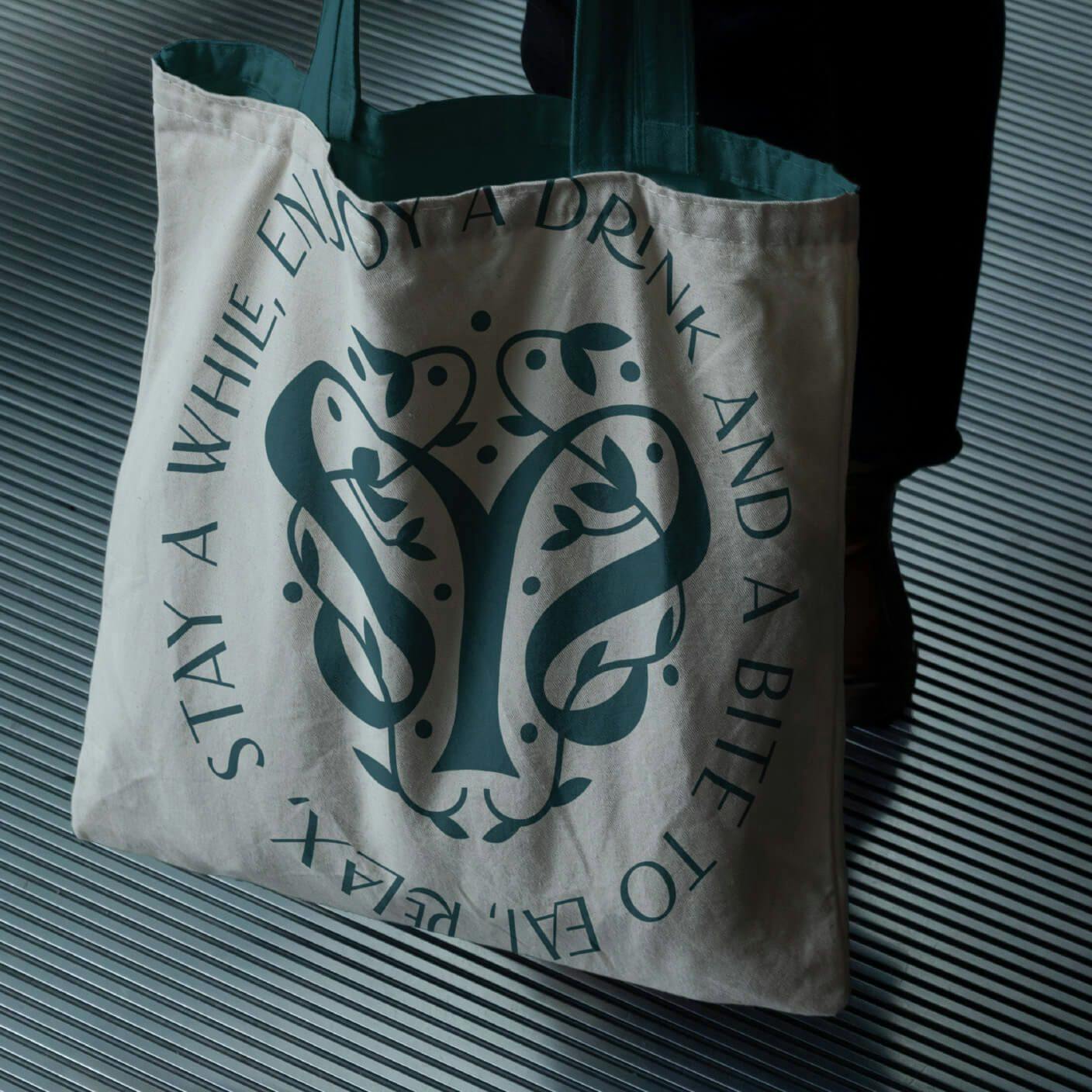
A place whose warmth, relaxed charm, nostalgia and commitment to quality hospitality became inspiration for a brand that celebrates its history-laden settings. The brand mark nods to the Manor’s rich connections to nature; a marriage of history, lush tree-lined forests and refined elegance. They wanted an identity that could fit timelessly with all they offered.
BEFORE & AFTER


RESULT
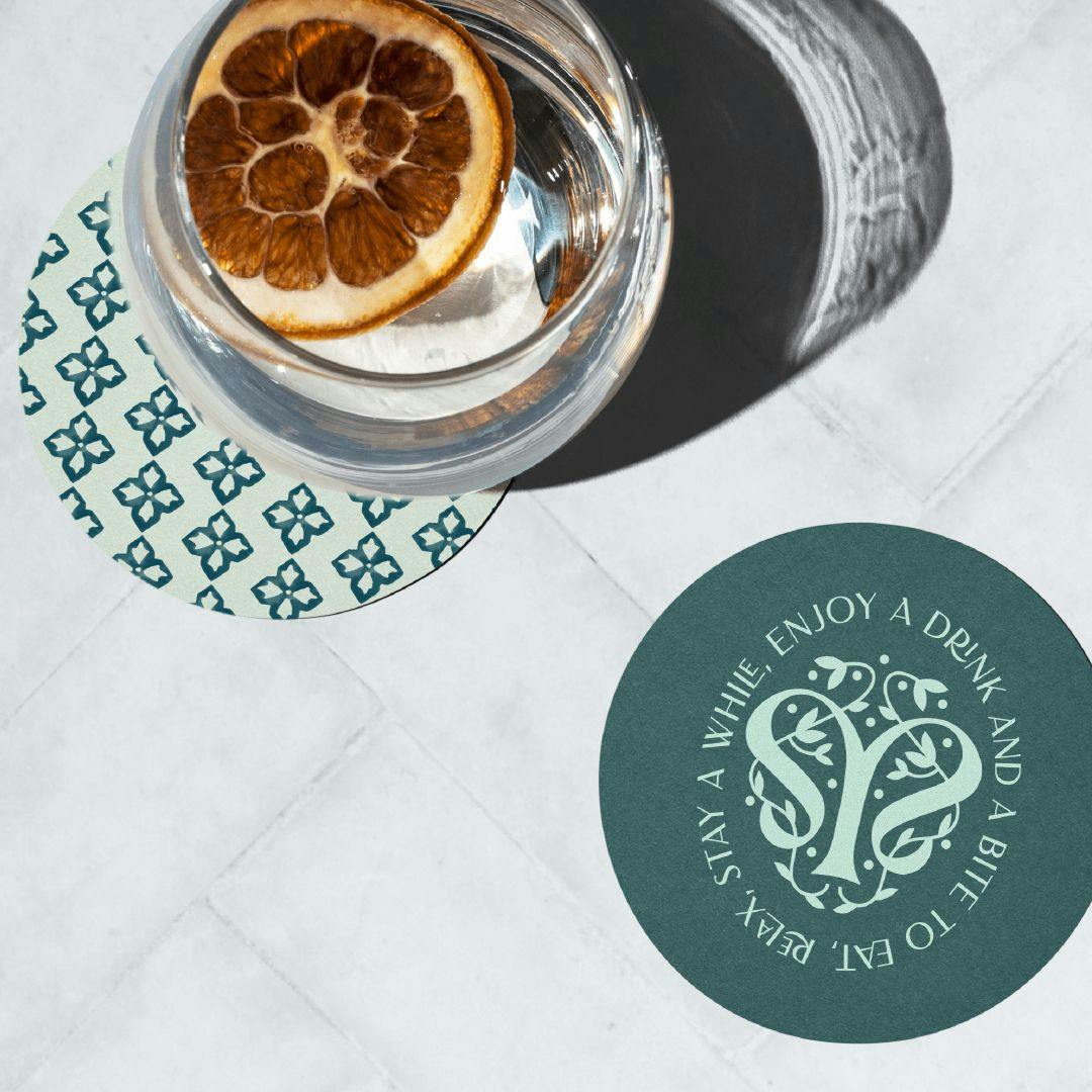
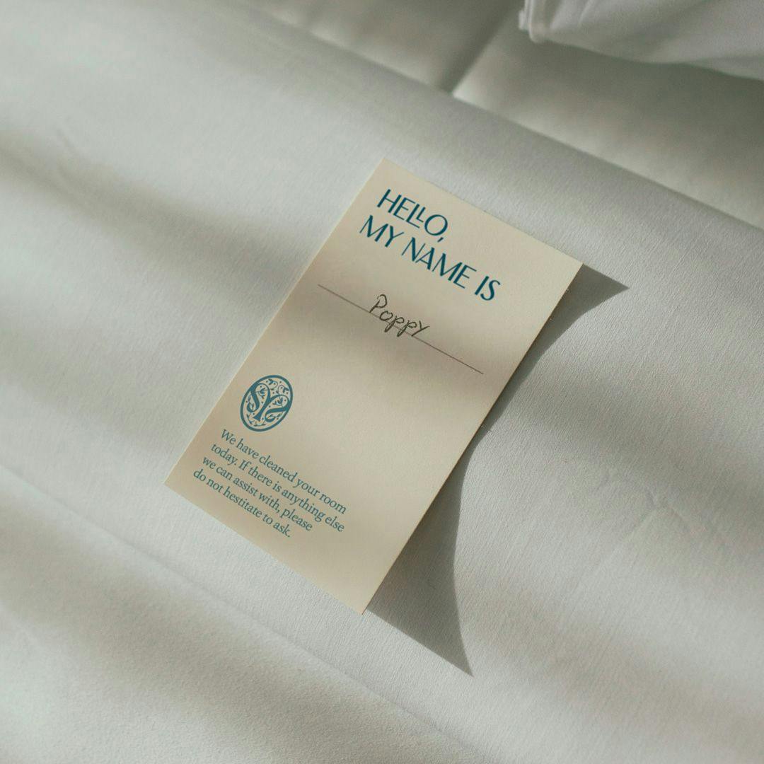
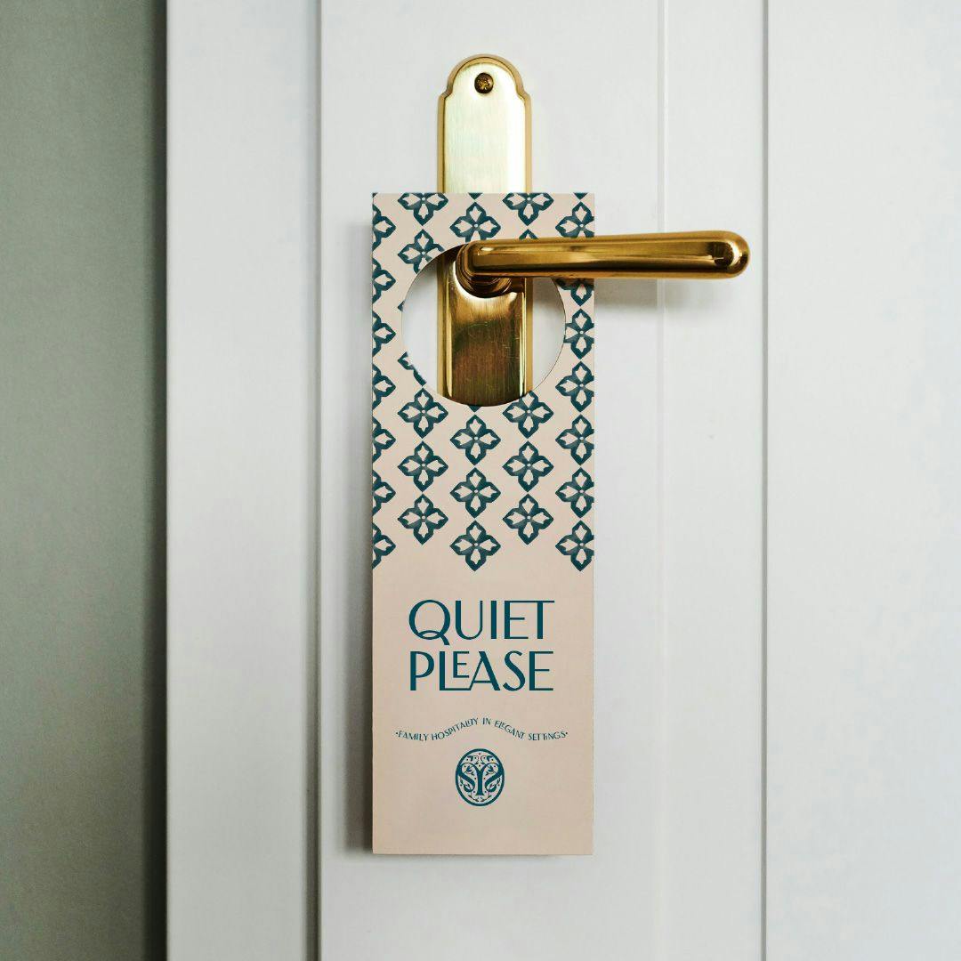
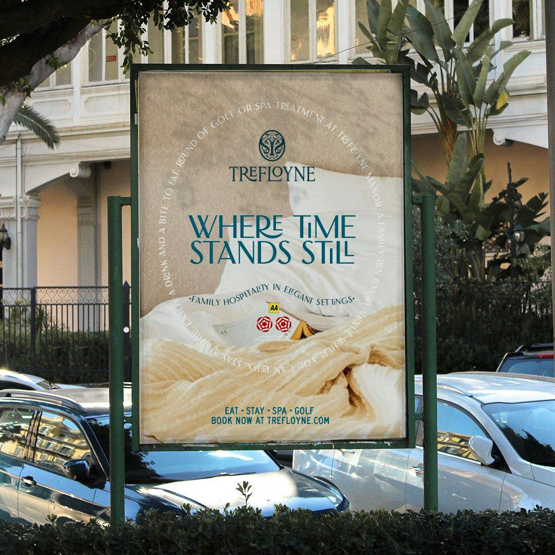
The overall brand is an enthusiastic embrace of the setting. It builds a nostalgic and modern aesthetic, embodying the warmth and hospitality of Trefloyne itself.



At home, online
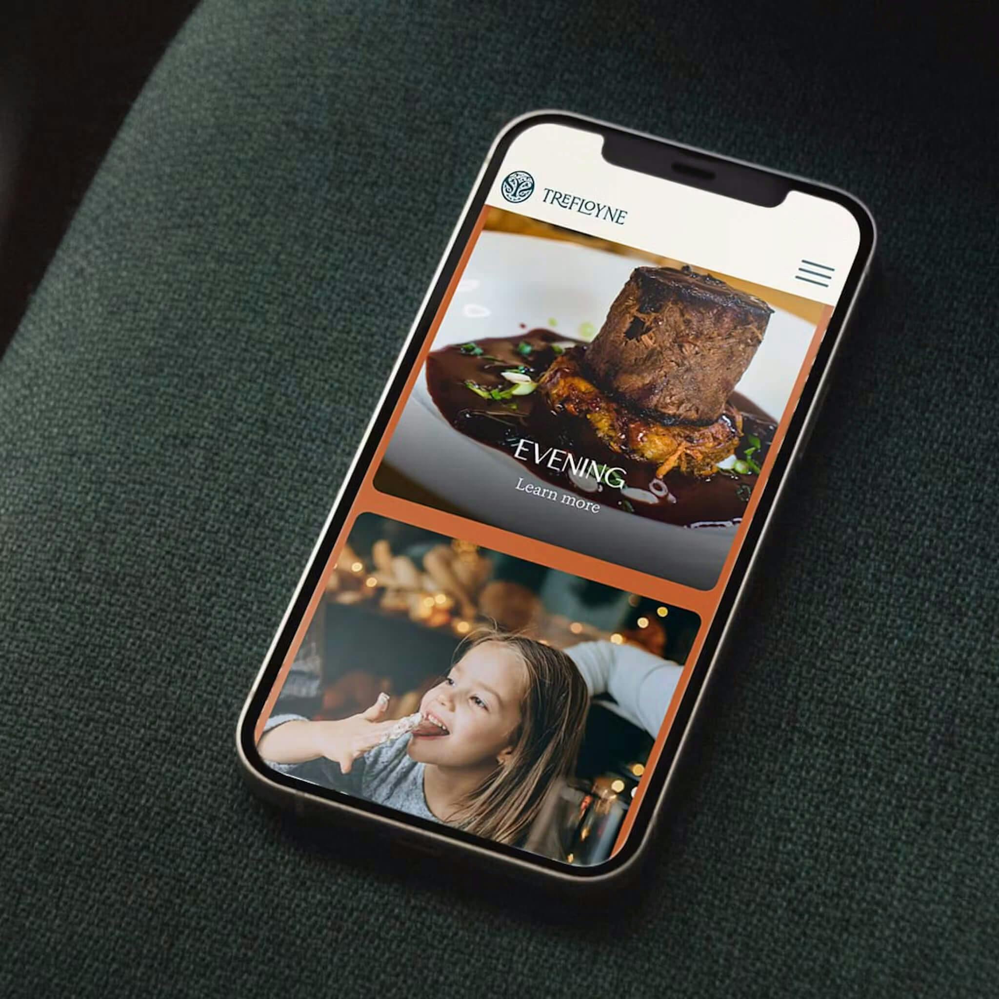
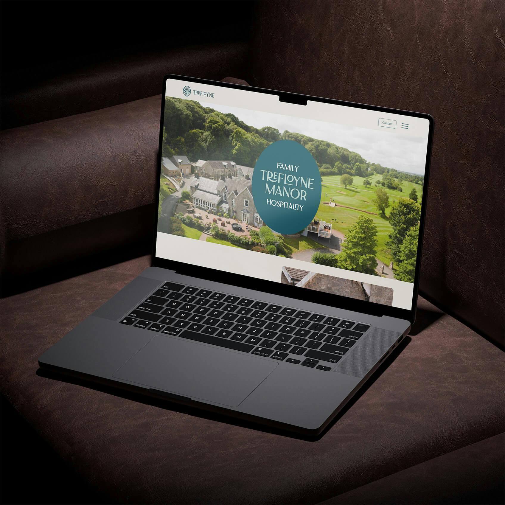
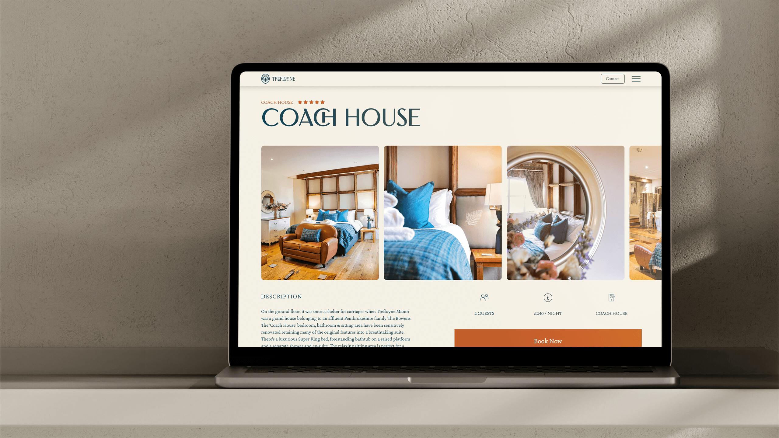
The fresh brand identity comes vividly to life on the redesigned website, where users can quickly and easily navigate to areas they’re searching for, booking a table, treatment or escape easily.
User experience
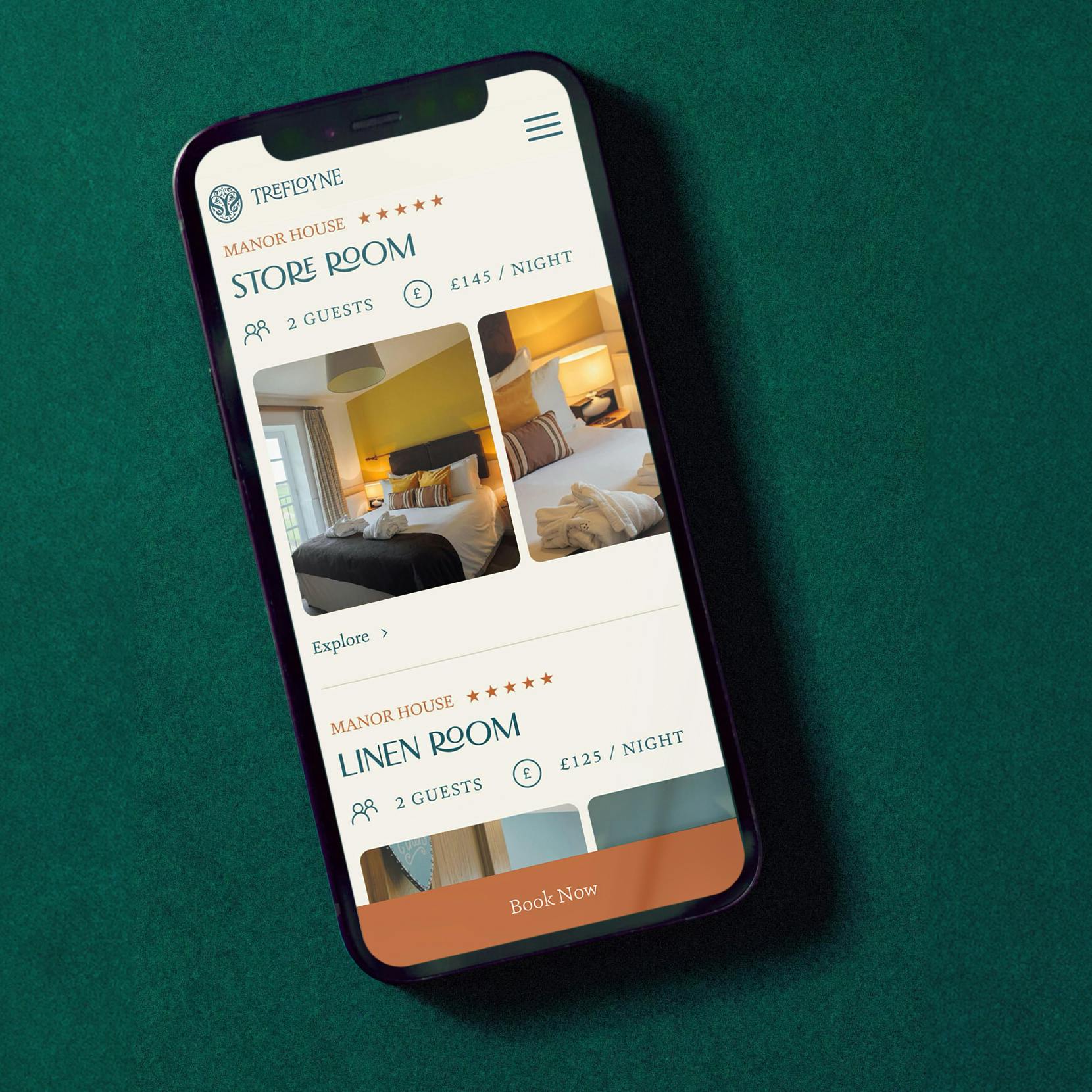
Hues of the forest, linen, herb, lavender, and burnt oranges create a natural but vibrant palette, reflecting the setting’s energy and creates a hierarchy. Clear, engaging copy speaks to the brand’s relaxed tone and, like any brand with purpose, it invites conversation and connection.
We now have a brand that stands out and resonates with our customers, speaking more authentically to the quality we offer. We’re thrilled with the results and look forward to working with the LGT team again.


